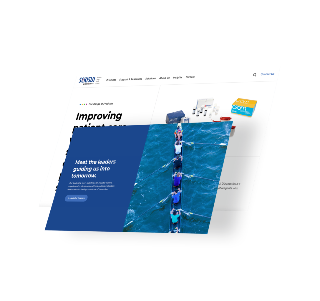
A new digital home for the diagnostics innovators building a healthier world.
New website, new opportunities for SEKISUI Diagnostics to reach healthcare leaders.
The client.
For over four decades, SEKISUI Diagnostics has been providing the diagnostic tests, point-of-care tests, and raw materials that innovators in the healthcare industry need to push new boundaries and improve patient outcomes.
To reach all audiences and make the path to products as simple as possible, SEKISUI Diagnostics needed a new, re-organized and user-friendly website that reflected their own innovative spirit.
The challenge.
SEKISUI Diagnostics does a lot—and telling a cohesive, easy-to-understand story to all audiences together and individually meant re-thinking the way information is presented throughout the user journey.
By working closely with the SEKISUI Diagnostics team to understand their customers, we designed and developed a new site built to be not only beautiful, but also highly functional for maximum conversion potential.
Refreshed branding meets an all-new, engaging UX.
As a medical sciences company, a clean, intuitive design was imperative for SEKISUI Diagnostics. Their laboratories and facilities are sleek, clean environments, and so we wanted their new digital home to emanate this same efficient, uncluttered image.
This meant using clear, legible fonts, tasteful accents of color, high-resolution images, and an unambiguous navigation structure. These, together with engaging scroll freezes and integrated brand colors throughout, offers a modern and lab-ready look and feel that matches the user’s expectations.

Through our collaboration with the SEKISUI Diagnostics team, we dug deep into the unique expectations of their customers. That helped us build a site architecture that met the needs of all users—and made it easy for them to take that crucial next step toward conversion.

Conor Snell
Director of Content Strategy