An elevated digital space for champions of visionary spatial experiences.
The client.
How does an innovative brand infuse their biggest ideas into real-world, physical spaces? By working with Generis Collective, a commercial property development solution who specializes in helping visionary businesses in healthcare, hospitality, entertainment, retail and beyond—including Google, Tesla, Stella McCartney, and Warby Parker—create elevated guest experiences.
By assembling an arsenal of curated third-party partners (architects, interior designers, engineers, fabricators, general contractors, and more), Generis Collective offers a single, creative point of contact for their clients through complex and innovative projects.
The challenge.
Formerly known as “LOC Associates,” the newly introduced “Generis Collective” represented a fresh step forward for the brand and business. This elevated identity needed a new website to match, but the brand itself needed to feel like a natural evolution of their history, their experience, and their legacy.
Our goal: to reposition what was historically a single “development-focused” association into a full-fledged start-to-finish partner and collective of expert minds. By evolving and building from the brand with a new logo, updated visual identity, and brand messaging, we worked with Generis Collective to do just that.
Making spaces for unique guest experiences.
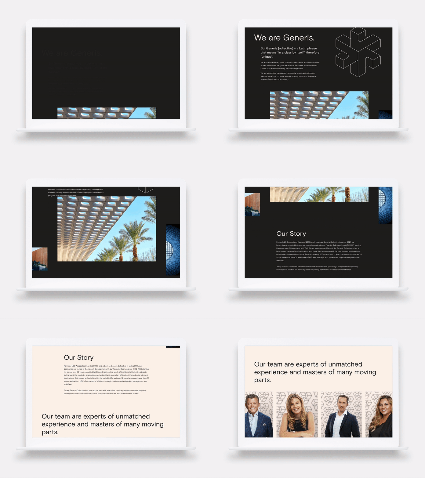
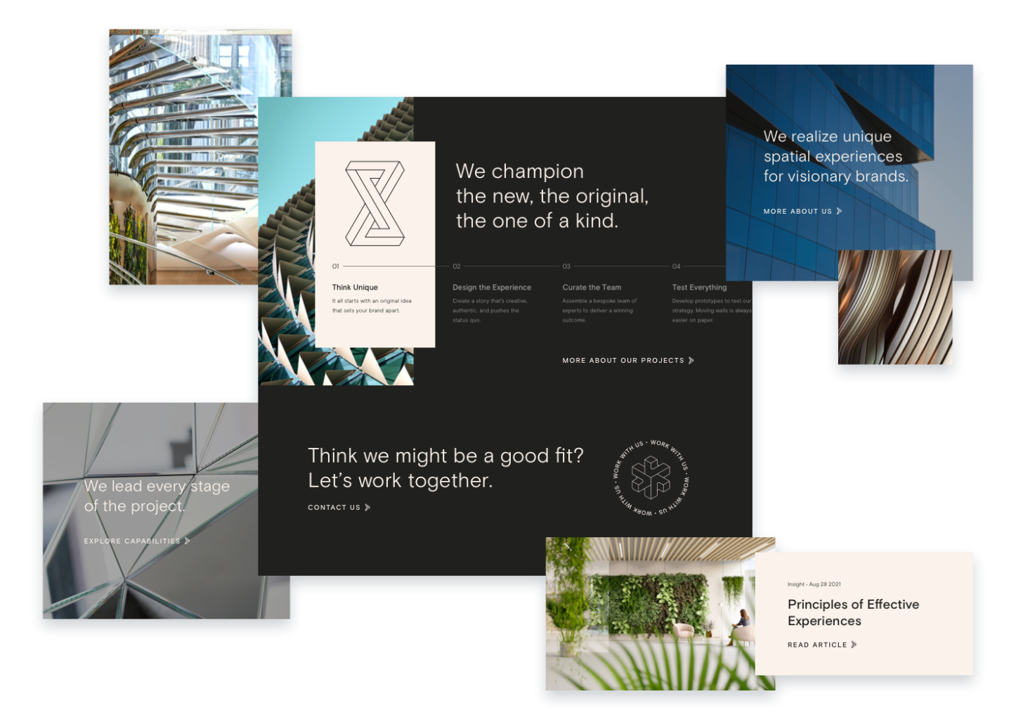
At the core of their skillset, Generis Collective specializes in creating unique, visionary spatial experiences for their customers. To match that, we knew we needed to create an equally unique digital spatial experience for their users.
We laddered all our design decisions up to this overarching visual theme, which we brought to life using features like load-in animations, parallax effects to create depth, scroll hijacking to take the user in an unexpected direction, and background color transitions to highlight key elements. The result: a unique, exploration-worthy digital experience as intriguing as any of Generis Collective’s physical spaces.
I love that we were able to translate the essence of what Generis does — create unique spatial experiences — into their digital presence.
Showcasing the best of what they build.
Showcasing Generis Collective’s portfolio proved a unique challenge due to contracts and legal obligations, and so our team quickly understood the need to reinforce the brand’s expertise and talents in creative ways.
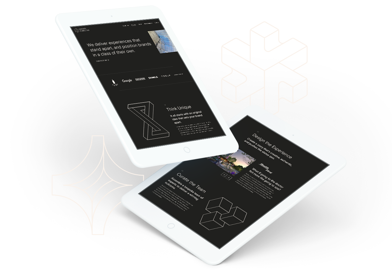
We turned our main storytelling focus on the “Process” page, which offers users deeper insight on Generis Collective’s proprietary 6-point methodology for driving successful projects. This included details around how they approach each bespoke project, as well as client logos, images, and stock photos where appropriate to provide the right look and feel to match their unique story.
Holding it all up with a dev foundation.
Modern architecture highlights the beauty and complexity of simple, structural materials through complex geometry and engaging designs; so too did the new Generis Collective website need to infuse rich, engaging, and innovative features throughout what would otherwise be considered a “small” website.
We implemented robust front-end technology throughout the site’s core pages to reflect that modern ethos, showcasing how Generis Collective can make a big impact on projects through clean, ordered arrangement of complex pieces. The result shows off not only our developers’ skills in crafting beautiful sites, but Generis Collective’s skills at putting the right resources into each step of the project.
