Giving stories from around the globe a new space to call home.
Exploring everywhere, anywhere.
The client.
EF Tours has one driving belief: that every student deserves to experience the life-changing impact of educational travel.
Guided by a philosophy that “sharing new ideas, new cultures, new stories, and new experiences leads to more potential and possibility for both students and teachers,” Education First has spent nearly six decades guiding immersive, education-focused tours for students, parents, and educators interested in travelling all across the world.
The challenge.
With so many great perspectives from travel participants, EF Tours needed a new space to host their wealth of travel stories.
They needed a partner to help reorganize blog content into more intuitive categories and a more navigable structure, with a strong emphasis on SEO. Our goal was to redesign the blog UI to align with the EF brand look & feel—and, ultimately, keep users on the blog longer, digest more blog content, and become incremental leads.
Making every journey through the blog an adventure.
When we first partnered with EF Tours, their existing blog’s categorical structure aligned neatly with their internal brand pillars… but what they needed was a structure that served more of the content their users were really searching for.
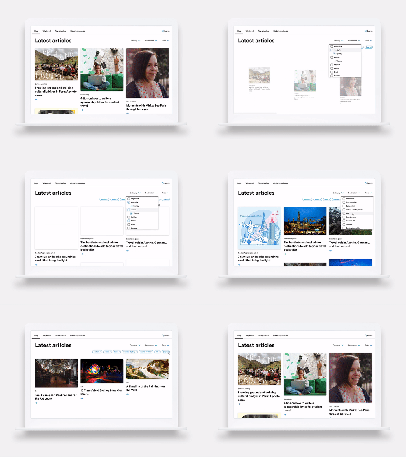
We created a robust, flexible tagging system to accompany the three new content categories, which allows each article to be tagged with an unlimited amount of topics and locations. Based on this new organization, we also upgraded the search and filter system, letting the user search and filter by categories, topics, and locations.
This new organization also allowed us to leverage more ‘related content,’ encouraging users to keep exploring topics or categories that capture their interest.
Telling richer stories with modernized content layouts.
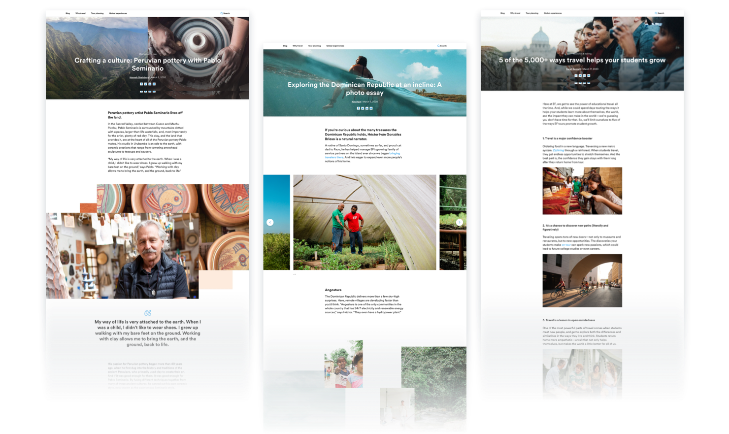
Our team helped elevate the EF Tours blog experience by modernizing page layouts, removing the sidebar, and allowing for full-width sections to better immerse the user in each individual article.
We introduced a library of flexible modules to support a variety of article content. This includes features like an image or video slider, listicle content, masonry image grid, media embed, and more to aid in storytelling.
The result: content experiences bolstered by more engaging layouts, helping to take all those travel stories beyond just text-based content.
“The blog's clean, minimal look and feel allowed the focus to really shine on the content – the enriching travel experiences EF is known for."
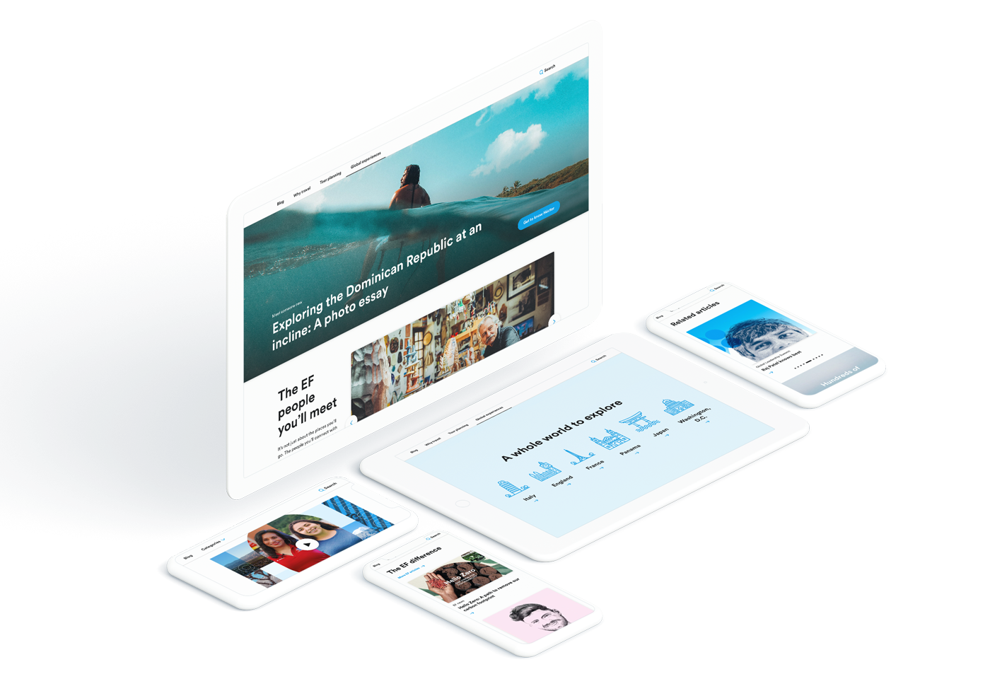
Letting the brand shine with clean, minimal design.
Because EF Tours is one branch of the larger Education First brand family, we crafted the new blog experience to align neatly with EF’s tight brand guidelines.
Generous use of white space, coupled with their minimal color palette (black, white, and pops of light blue to indicate interactive elements), allow for their strongest design asset to shine: their photography. EF Tours puts a heavy emphasis on beautiful travel photography, which plays a crucial role in captivating their users and, ultimately, selling more amazing experiences.
