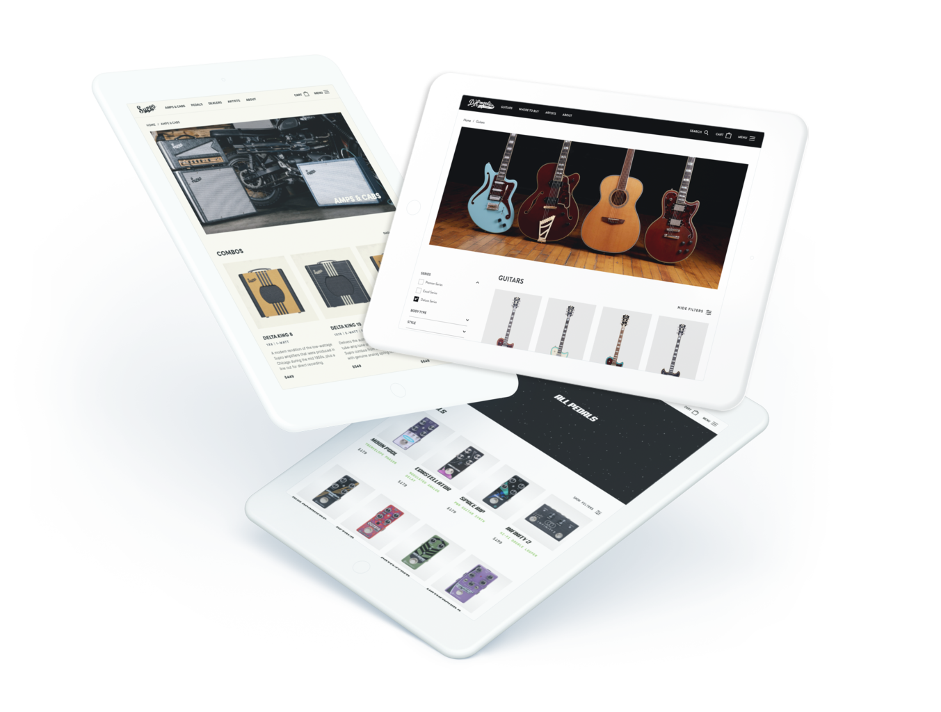
Elevating quality craftsmanship with a new digital experience.
Showcasing superior instruments made with the utmost passion.
The client.
Great guitar players get inspired by the sounds of the masters–and master guitar players perfect their sound with D’Angelico Guitars.
Founded in 1932 by John D’Angelico, one of the most revered luthiers of all time, D’Angelico Guitars is a landmark New York City-based guitar brand. For nearly a century, they’ve been making some of the finest archtop and semi-hollow guitars in the world.
Today, D’Angelico is in the midst of a modern resurgence, focused as much on bringing in a new generation of players as on keeping loyal fans engaged. They needed a new digital experience that honors the company’s roots while building ambitiously toward the future.
The challenge.
We knew that a new website for D’Angelico needed to uphold the brand’s legacy while appealing to the needs of modern players.
To match that timeless New York style, we reached back to Art Deco vibes, giving the brand a sleek, sophisticated, yet still rock and roll appeal as comfortable at a Grateful Dead show as at a refined jazz club.
Using a minimalist color palette and a balance of Art Deco and minimalist design to reach players new and old, we crafted a website that could help elevate this classic brand in a brand-new platform.
Letting the products shine.
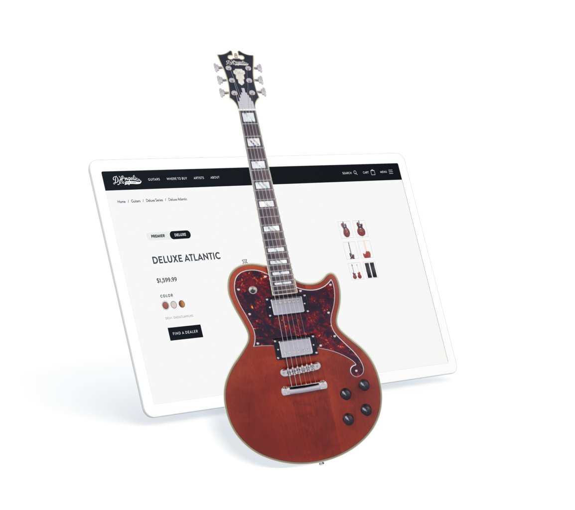
So much of the appeal of D’Angelico is wrapped up in the sound, look, and beauty of their distinctive arch-body guitars. For players looking to capture a bit of that magic for themselves, picking the product needed to feel nearly as fun as plugging into an amp for the very first time.
We crafted a product-focused shopping experience designed to make browsing and comparison both simple and enjoyable. Clean, digestible product pages interwoven with the brand story let each distinct product breathe, and beautiful product shots give players opportunity to ogle as they browse.
Responsive modules work well with the layouts of the imagery, paired with CTAs that help enhance page flow and ultimately sell more guitars to more players.
Merging modern style with a history of excellence.
The form and features of D’Angelico guitars have evolved over time, but that doesn’t mean the brand has lost sight of their long and legendary history. We merged these concepts through an updated information architecture and UX that reflects this story as you explore the site.
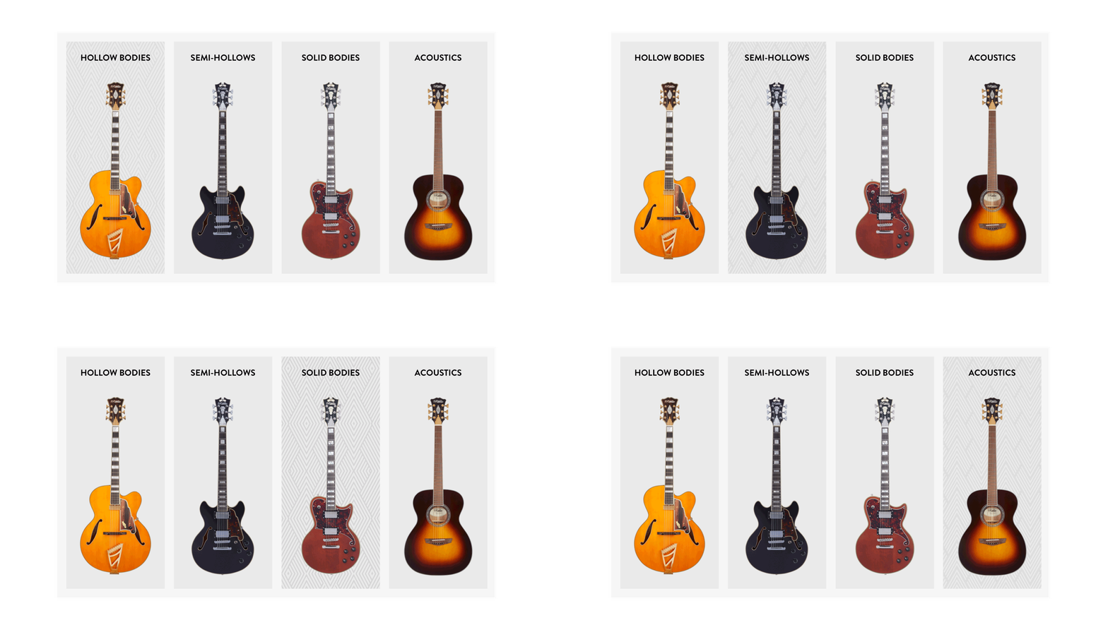
Combining beautiful product shots with accents of brand elements and patterns, we infused the user experience with a sense of newness combined with those time-honored feelings of sophistication, history, quality, and relevance. Users can explore guitars by series and by type, seamlessly experiencing the evolution from the classic hollow body style to the modern semi-hollow, solid body, and even acoustic offerings.
"Letting the beauty of D'Angelico's guitars shine through in a site that truly embodies their brand was a satisfying design challenge."
Joe Gallo
Senior Web Designer
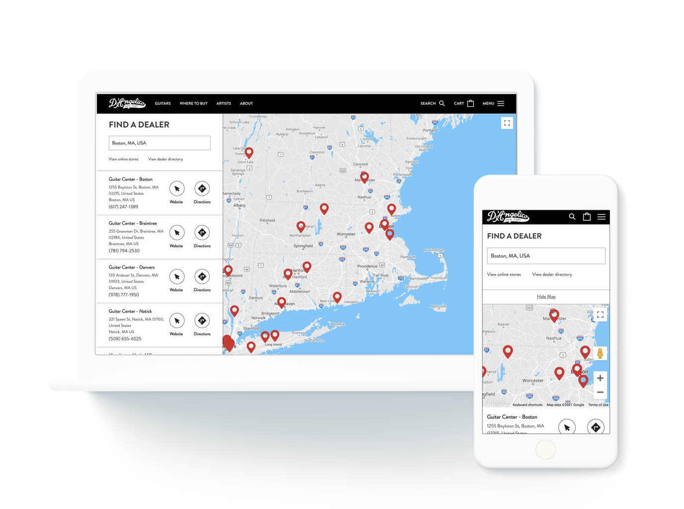
Find classic sounds, all over the map.
A big piece of the puzzle for modern players is just how they can get their hands on one of these classic New York-style guitars, even when they’re on their grand world tour. We solved that by introducing a truly accessible product locator to this exclusive-feeling brand–helping just about anyone get their hands on a D’Angelico regardless of where they’re located.
Three classic brands, one modern framework.
D’Angelico carries a long history to today’s players, and it does it as part of the Bond Audio family of brands alongside other industry leaders like Pigtronix and Supro. These three brands are each unique in their own ways–but their similarities are what tie them together under one roof.
This connection offered a great opportunity to lean into flexibility with design and development of the website. That’s why we crafted the D’Angelico site on the same flexible platform as its sister brands, giving each its own unique feel and personality under one unified website structure. The result: three unique brands, all gathered under one efficient framework.
