We build a lot of websites and the partner organizations for whom we make those sites often conceive of the “design process” as beginning and ending with figuring out how everything will look. This is a perfectly reasonable assumption. When most people think of design, they think of style and aesthetics.
However, there is one crucial step that must take place before any decisions are made regarding color schemes, typography, images, multimedia, or on-page copy: wireframing
What is a Wireframe?
Wireframing is all about structure. It’s the practice of mapping out how everything will work, forgetting (temporarily) about how it looks, and focusing on functionality.
This framework offers designers a concise graphical representation of the interface’s information architecture (IA), enabling them to visualize the cohesive arrangement of its various components.
During the wireframing phase, your team strips and distills the future digital product down to its most basic building blocks and asks:
- Do these modules make sense as elements within an interconnected system?
- Is this system laid out in a way that creates an environment and an experience that produces the patterns of user behavior that we’re looking to encourage?
Your wireframe is essentially the blueprint for your final design. It shows how users will encounter and move through the digital space you’re constructing. By representing the various modules, functionalities, and interaction points on the page as (to use a sports analogy) X’s and O’s, you can more objectively assess and plan how the design will function and flow without getting bogged down by stylistic details.
Once you’ve created this bare-bones, two-dimensional sketch of your planned interface – using only lines, vertices, basic shapes, and filler text – you can play around with the spatial allocation of content and the hierarchical prioritization of information.
The only minor caveat to this bare-bones approach would be if, in your initial discussions, you decide with absolute certainty that there are certain stylistic brand elements that stakeholders want to be included, such as fonts, logos, etc. In such cases, you can tactfully work those elements into the wireframe as long as they don’t distract from the user flow you’re aiming to convey. There’s nothing wrong with creating a slightly more fleshed-out and visually appealing blueprint, provided you’re able to view the various blocks on the page impartially, like pieces on a chessboard, ready to be moved in accordance with your overall strategy
How Wireframes Help Streamline a Design Project
Wireframes offer several benefits throughout the design process that boost productivity by making workflows more efficient:
Templatized Creativity
The creative process can become chaotic without guardrails and conduits to channel and hem in new ideas. For designers, a wireframe functions much like an article outline does for writers, providing structure and organization to their thoughts as they approach a blank page.
Incorporating wireframes into the beginning of the process won’t be as exciting as jumping straight into design, but you will undoubtedly have a better design in the end. The visuals will flow better, and most importantly, it will maximize conversions.
It is a modular ‘plug-and-play’ framework that streamlines workflows and boosts productivity by allowing designers to focus on individual aspects of the page, one piece at a time, rather than building it all from scratch.
Spot Structural Issues Early On
Within a wireframe, structural errors have nowhere to hide. Big, shiny graphics and featured images can act like makeup, obscuring technical blemishes underneath. The bolts and beams holding everything together become harder to see once they’re covered in finalized content.
This is why a simple framework is crucial when attempting to assure quality prior to advancing to the design phase. By pinpointing potential usability issues early and implementing essential adjustments, you set yourself up for a smoother ride down the road.
Wireframes are Quicker and Less Expensive to Adjust
If our design team were to approach a client with a high-fidelity mockup of their new website before a wireframe had been created, and the client was unhappy with what they saw, implementing their edits would take lots of time and therefore cost lots of money. The very definition of a lose-lose.
Instead, presenting the client with a well-organized wireframe – while admittedly less exciting for them to look at – is infinitely easier for us to adapt based on feedback. This saves dozens of hours and significant resources by allowing our designers to carry out changes relatively effortlessly to a greyscale outline.
Building A Strong Report and Good Communication from the Outset
Wireframing is a group effort. Its purpose is to get everyone involved and invested in the page on the same page regarding its layout. Early on in an engagement, this lets everyone get familiar with their coworkers’ and clients’ creative preferences and visions for the project.
Furthermore, when you use the right tools and construct your wireframe in a format that is communally editable (more on wireframing tools later), you create a public brainstorming forum that fosters close communication among designers, developers, and stakeholders. This encourages alignment and clarity across all parties involved prior to advancing the project to the design stage.
How to Know You’ve Reached the Design Phase
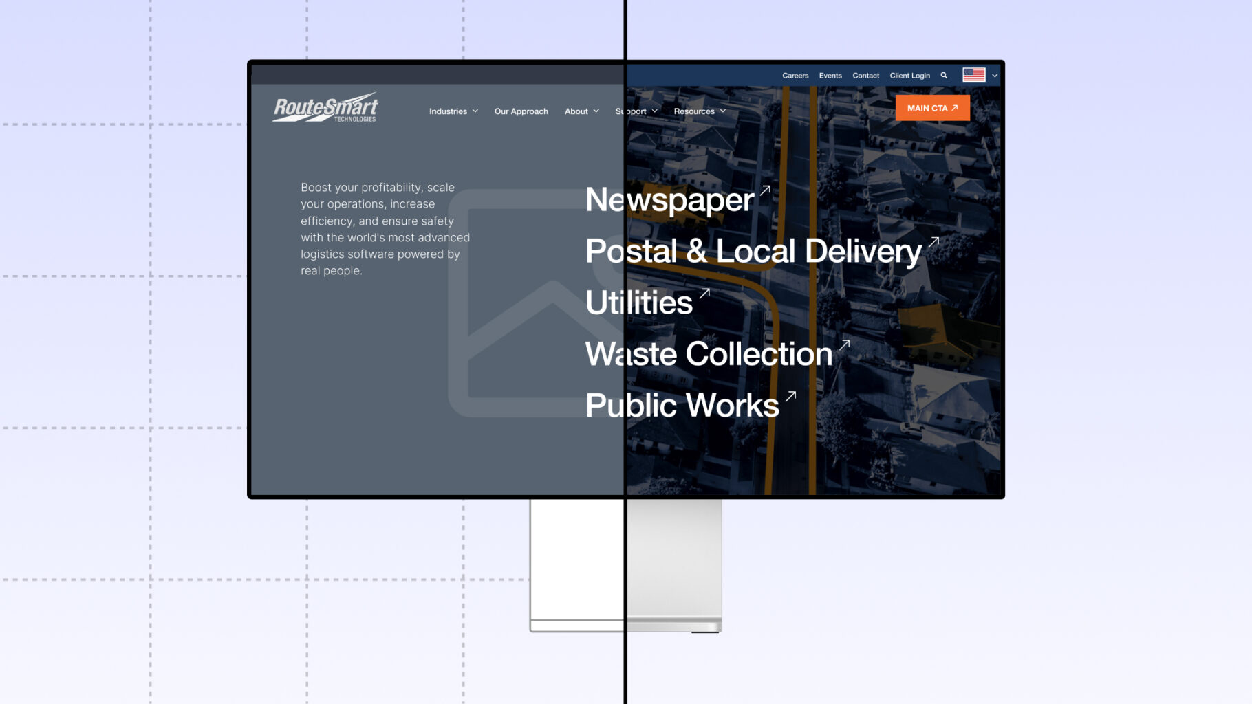
In the context of a web build, a “design,” also known as a “mockup,” is a detailed, polished, filled-in, and fleshed-out version of your wireframe. This is an important terminological distinction because, everywhere else in life, a design can mean pretty much anything.
It specifically means a high-fidelity, nearly-pixel-perfect, production-ready representation or prototype of the final deliverable. The design will incorporate all those fun visual elements that you’ve so patiently held off on including until now such as colors, fonts, images, and graphics.
In any web build project, this exciting transition from initial wireframing to real design phase is signaled by several key factors:
Enthusiastic Stakeholder Consensus
Once the wireframes have been thoroughly reviewed and refined to the point that they accurately represent the functional layout and structure of the website, and everyone working on the project is uniformly excited about the outlines, it’s time to move forward.
You’ll know when you’ve arrived at a juncture because the wireframes will have clearly served their purpose. The content hierarchy will be outlined, navigation pathways paved, and basic functionality agreed upon. The team is now undeniably ready to start injecting creativity and personality into the product such as typography, color schemes, and branding.
Designers and Developers Agree that It’s Doable
As the wireframes reach their final iteration, conveying the intended user flow and interface elements, designers and developers need to feel confident that they can flesh out the planned aspects of the design and bring the blueprint to life. They need to see the wireframe and know that they can carry it through to completion.
Project Managers Give the Green Light
Ultimately, the decision to transition is a collaborative one. However, in the end, it’s largely guided by project timelines, scopes of work, and client expectations. Ideally, the team’s readiness to embark on the detailed design work aligns with this timeline. But, when it’s time to stop planning and start working, you may be required to charge ahead and give it your best effort.
Embarking on a Successful Final Design Phase
The final design phase marks the transition into more visually striking and interactive interfaces. Mockups are usually crafted using digital design programs like Figma or Adobe XD, demanding more time and effort but providing a precise depiction of the final interface.
In short, here is where you bring the wireframe outline to life. You turn two-dimensional shapes into three-dimensional images and put into animated motion previously static elements.
Shifting your team’s focus from the high-level user flow/journey to ground-level, user experience is the goal of this phase, and it offers numerous advantages.
Realistic Representation: Final designs offer a tangible preview of the live asset, enabling designers and stakeholders to assess the look and feel of the website or app.
Consistency and Brand Alignment: The process of refining mockups helps in establishing a cohesive and visually appealing interface that resonates with the organization’s personality and identity, fostering brand recognition and trust.
Detailed Feedback: All the nitty-gritty critiques and feedback from stakeholders that would only logjam the wireframe process is welcomed in the design phase. The more granular the better, as it facilitates in-depth refinements and specific improvements based on a client’s personal requirements and preferences.
Development Guidance: Just like wireframes are the guiding compass for designers, mockups serve as a blueprint for developers. They equip them with a realistic set of the necessary visual elements and functionalities that they will be expected to translate into the final digital product.
Successfully and seamlessly entering the final design phase involves understanding these benefits to ensure an interface that not only meets the functional requirements but also engages future users and reinforces the brand’s identity.
Real Client Example of Wireframes vs. Designs
Let’s take a look at a real-world illustration of wireframes and designs in action.
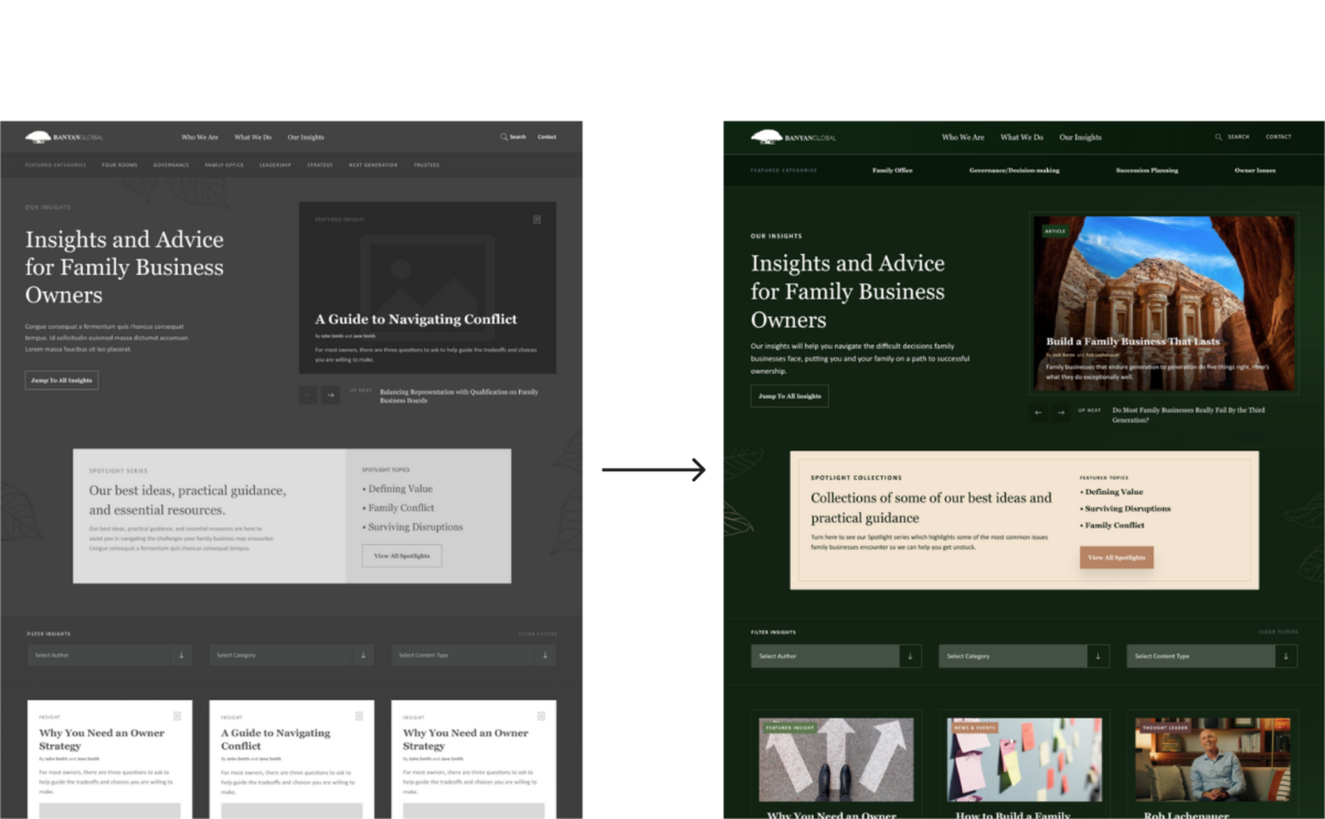
Client: BanyanGlobal Family Business Advisors

Banyan sought our expertise and ultimately decided to partner with us largely due to our insistence on employing a comprehensive, personalized, brick-by-brick approach to building their site. And they were truly with us every step of the way from Information Architecture (IA) and Wireframing, through to the final Designs.
As you can see from this one snapshot example of their Insights page, they took the time to work out how exactly they wanted users to encounter and progress through their resources. Instead of just dumping every article they had into one continuous feed, which would have taken us a matter of minutes to build, they strategically paved a path for visitors to browse, filter, and find the content that most resonated with their needs. They presented them with numerous opportunities for deeper exploration into particular topics, creating an experience more tailored to their interests.
As family business advisors, the Banyan team appreciated that anything worth building takes time. Measuring twice and cutting once, so to speak. Therefore, from the outset, they invested genuine effort in helping us lay a strong IA and wireframe foundation upon which a great digital product could be built.
By working together to develop the right stories and user flows, we helped build total stakeholder buy-in along every step of the journey. The resulting site is gorgeous, complex, and reflects their high esteem and capabilities in their industry. And it all went pretty smoothly!
Recognizing the importance of the project and the diverse perspectives of its stakeholders, Banyan understood the importance of a structured approach to gather and incorporate individual inputs, feedback, and ideas throughout the design phases.
Why Does This All Matter?
Every industry has its unique business language, its lingua franca. A set of specialized words and phrases that make perfect sense to those who spend 40+ hours per week immersed in that given field but tend to confuse folks visiting from other professional spheres.
It’s certainly not necessary for us all to become fluent in the parlance of each other’s trades. However, if you work for a firm that tends to outsource efforts like website or landing page design to a digital agency like Digital Impulse, it is deeply helpful to know what we mean by “wireframe” and “design.”
Appreciating the differences—in both form and function—separating these two stages of a web build project will make you a more confident leader and effective collaborator in the engagement.
I’ve seen teams jump straight into final designs, bringing color, life, and beauty to the forefront. This creates a more exciting beginning to a project, but because information architecture and wireframing weren’t a priority, it can result in a page that doesn’t perform as well. It can also undo design and development work if someone comes back after approving the design and wants to reorder sections, change functionality, or eliminate sections altogether, usually resulting in a delayed launch and/or increase in scope.
Having now read to this point, you are hopefully up to speed on what wireframing and designing entail, so let’s take a moment to reassess why it all truly matters. Why building frameworks fuels a better creative process and how understanding these frameworks will help you work more closely and productively with professional designers.
Clear Communication and Collaboration
Wireframes play a crucial role in conveying the conceptual structure and layout of your product. Designs, on the other hand, are instrumental in showcasing visual elements and illustrating how the final product will look and feel to your audience.
Understanding that these distinct deliverables serve unique purposes and are crafted at different stages of your project enhances communication between our designers and your team and streamlines collaboration with developers. It minimizes confusion and ensures everyone involved shares a common vision, facilitating smoother progress and ultimately leading to a more successful outcome for your project.
Time and Cost Savings
Creating wireframes and then designs will invariably save you time and resources in the long run. By identifying potential usability issues and making necessary changes in the wireframe stage before we begin the high-fidelity mockups, we can avoid costly revisions later on.
Your website is the centerpiece of your online presence, so when building a new one, it’s expected that feedback and criticism will be frequent and plentiful. This is why creating an outline as a precursor to the final designs is so cost-efficient. It enables us to gather your most important feedback at an early stage, facilitating fast, iterative refinement before we proceed too far.
Better User Experience
By focusing on the structure and layout in the initial wireframe stage, we ensure a logical and intuitive flow tailored to your users’ needs. At this stage, our priority is mapping your visitors’ journey through the webpage, rather than getting caught up in the appearance of specific graphics or the wording of copy.
In the subsequent design stage, our creative team directs their collective energy towards crafting a visually appealing and consistent interface that reflects your brand’s identity. This meticulous attention to detail significantly enhances the overall user experience and makes your product more appealing to users once it’s finished.
Closing Argument
Wireframes and designs are two essential but separate stages in the production process, each with its own unique purpose and benefits. By understanding the differences between the two, designers and the folks they work with can create better digital products.
Whether you’re creating a website, standalone resource, or any form of digital asset, be sure to utilize both wireframes and mockup designs to achieve the best possible outcome. If you’re interested in learning more about our design capabilities or would like to discuss creating an awesome new website for your brand, please reach out to us today.
Epilogue: Digital Wireframes – The Modern Preparatory Study
Ok, one last thing. And please forgive this author for breaking out of the professional third-person POV, but it’s easier for me to speak to you directly now that the closing argument has been posed and the curtain’s closed on the main article. Also, I realize that blogs don’t typically feature epilogues (epiblogs?), but I had an idea and there was no clear way to shoehorn it into the body sections of this piece, so here we are.
In considering the importance of wireframes when creating a digital product, it struck me that this is by no means a novel concept. Artists have been utilizing this exact order of operations to guide their work for centuries, if not longer. We know this in part thanks to the fact that one of history’s most well-known artists, Leonardo Da Vinci, left a lot of paintings unfinished. The man was undeniably a genius, but nobody would ever accuse him of being a completist. He was a begin-ist—a prolific initiator of projects whose spirit was animated by new endeavors and ideas, not stale long-languishing deliverables.
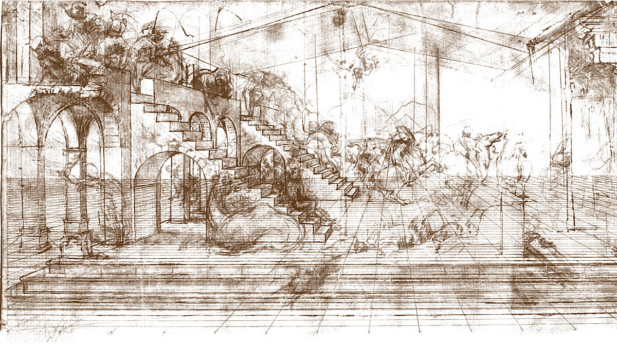
For us today, the result of one of humanity’s great creative minds having such a predilection for novelty and such a dereliction of due dates is a mountain of sketches, plans, and “preparatory studies” for paintings that he never got around to doing. See his 1481, study for the Adoration of the Magi.

These blueprints, left trailing in the wake of Leonardo’s infinite pursuit of the next big thing, allow us to glimpse behind the curtain into the meticulous, mathematical process of planning a painting. They let us understand and appreciate that beneath the final product, which, once framed and hung in a museum, looks so fluid and effortless, lies a painstakingly calculated latticework of lines, angles, and vanishing points.
That is, he didn’t just dream up an idea and start slapping paint on the canvas. He knew that for the final design to be at its best, a guiding framework needed to be laid first. The same is true half a millennium later when it comes to designing a website. You don’t simply begin painting.


